Home
/
Case
/
Modern Real Estate SaaS Dashboard
Modern Real Estate SaaS Dashboard
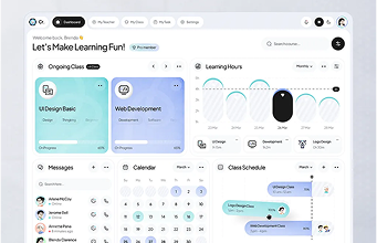
A clean, easy-to-use SaaS dashboard designed to help landlords and tenants manage properties, rent, and essential data more efficiently. Built with a focus on clarity, quick actions, and a smoother day-to-day management experience.
SaaS
Web App
UI/UX
CLIENT
Matt
CATEGORY
SaaS Dashboard
TIMELINE
1 month
LIVE VIEW
Project Link
SERVICE WE PROVIDE
UI/UX DesignWireframeWeb App
Share this Case Study:


SERVICES I PROVIDED
UI/UX DesignWireframeWeb App

Share this Case Study:
About the Project
San Francisco-based company SpaceBooks operates as a SaaS platform that provides accounting software to small and medium-sized businesses. SpaceBooks has built a comprehensive solution with invoicing and time tracking, as well as financial dashboards and tax summaries, through its components.

Users were abandoning the system, while most customers failed to progress beyond their initial visit. SpaceBooks needed only cosmetic changes because their team needed an update that would strengthen user engagement, simplify platform navigation, and increase the platform’s overall credibility.

The Problem
Spacebook's site was losing users fast. New users struggled to know where to begin. The UI looked overwhelming, and lots of them gave up on easy tasks. Even return customers didn't return after a first visit, and support tickets kept increasing.

> 60% user drop-off after first use.
> Poor navigation frustrated users.
> Customers couldn’t find key features.
> Untold support teams face overwhelming usability complaints from users.
My Solution
Spacebook's site was losing users fast. New users struggled to know where to begin. The UI looked overwhelming, and lots of them gave up on easy tasks. Even return customers didn't return after a first visit, and support tickets kept increasing.

Design System
We developed a comprehensive style guide for Boon, emphasizing a vibrant and engaging visual approach. Green was selected as the primary color due to its strong associations with growth, success, and reliability.

Design Process
Our Spacebook design process follows a Lean UX methodology consisting of four distinct steps. The methodology provides business-oriented steps supported by the principles of transparency and the requirements of both velocity and scalability.

UX Research & Design Artifacts
Understanding what customers required was our first step, which we achieved through in-depth research. We observed how real users behaved across different product pages and tasks. The goal was to identify friction points and turn them into opportunities for clarity, speed, and elegance.

We learned that people who buy online mainly focus on ease, inspiration and trust instead of just the clothing itself. Because of this, we updated important flows to suit that demand. Every choice in the design was focused on clear navigation, reactive responses and a superior feel.

Wireframe Concept & Stretcher
Clarity, speed, and user confidence were prioritized in the previous UX design. We created an intuitive dashboard that provides real-time financial insights, total transaction amounts, invoicing information, and time tracking, all in one place. Simple status indicators, intuitive data visualizations, and bold fonts (Inter Font) ensure usability on any device.

Related Projects
Loading related projects...
Have an MVP Idea?
Schedule a Google
Meet or Zoom Call
Project Request
Book a Meeting
| Project Request | Book a Meeting |
|---|---|